County-Level Analysis of the November 2016 Wisconsin election
- When modelling the change in vote for 'Other' candidates from 2012 to 2016 against other relevant voting and demographic variables, the proportion of wards/municipalities in each county using optical or digital scanning hardware comes out as strongly significant.
- However, this influence appears to occur in counties regardless of previous voting record for Republican or Democrat.
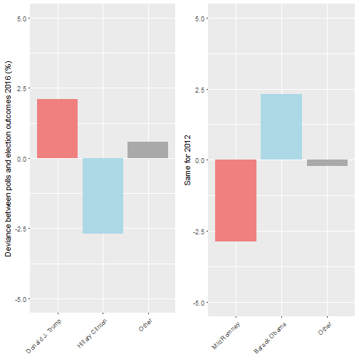
- The state-level election results, and difference from polling did not deviate significantly from historical trends.
- No single county stood out as an outlier when considering voting patterns in the 2016 and 2012 Presidential elections.
Introduction
The 2016 Presidential election surprised many with unexpected results in several states that ran counter to the polls, and counter to recent trends in these states. Specifically, the previously-assumed 'safe' states of Wisconsin, Michigan, and Pennsylvania switched from Democrat to Republican, and were key to clinching the victory for Trump.
Concern has surfaced by those close to the events of election night, specifically that the USA was under attack from hackers during November 8. Some feared that hacking may have had some influence on the election, especially in areas where optical scanner presence are in use e.g. this Facebook post. Since the result in Wisconsin was so close, and the result so unexpected (at least judging by the polls close to election day), I decided to use my R skills to try to look deeper into the Wisconsin results. All the input data and code used for this analysis is provided in my GitHub repository.
I had a few questions before going into this analysis. Were the 2016 Wisconsin election results results unexpected compared to historical trends? Did the results deviate significantly from the polling? Did the results vary significantly by county, and did the presence of optical scanner presence in polling stations affect the result in any way?
State level analysis
The results did not deviate greatly from the national vote
Nationally, 47.2% voted for Trump vs 47.9% for Clinton nationally, leaving other candidates with 4.9% uselectionatlas.org. In Wisconsin (with 95% votes counted at time of writing), Donald Trump won with 47.9% of the vote compared to the 46.9% of Clinton, a difference of only ~27,000 votes. The majority of 'other' voters went for Gary Johnson (3.6 of the 5.1% who voted 'other' in Wisconsin), and Jill Stein received just over 1%, both close to their national averages.
So far, nothing strange.
The November polls were off, but not more than in 2012
I downloaded the data from the 2016 polls in Wisconsin for 2016 from the HuffPost Pollster API, and subset it to looking only at polls started 7 days before the election or later. Focusing on decided voters only, Clinton underperformed on election day (2.7% lower than poll expectations), Trump overperformed (+2.1%), while 'Others' slightly overperformed (+0.6%). This means that more of the 'undecideds' went to Trump, or that many potential Clinton supporters chose not to turn up.
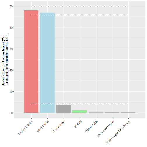
Were the polls particularly innaccurate in Wisconsin in 2016? I compared these polls with those from 2012, focusing again on polls started 7 days before election day. The polls show that deviations from the polling expectations were also close to 3%. So the size of the deviations between the final vote and the polling in November 2016 are not significantly out of line.
 Of course, this result will be affected by the polls you choose to compare with the final results, so I cannot discount that other analyses will find another result! I felt that by choosing polls closest to the elections, and considering only likely, decided voters, we could get the most accurate picture of what the pollsters expected. However, I am happy to be corrected.
The swing in votes and turnout fit within historical trends
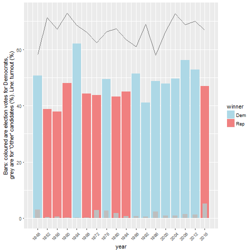
Comparing the 2016 election to those back to 1948, it does not appear that the votes for the Democrats, or turnout, differed significantly from historical trends. The 'other' vote percentage is noticeable, as it is the highest recorded since 1948; However, we have previously noted that this percentage matched the national average.
One other thing to note is that Wisconsin has voted Democrat since 1988, making 2016 the year to break a 7-election trend. Unusual, but nowhere near enough to note anything suspicious.
One other factor we can consider with this data is the % swing in votes or turnout from one election to the next.
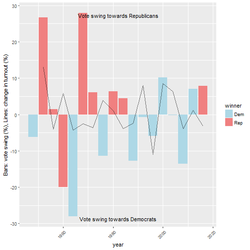 This figure shows that although there was a significant vote swing from Democrats to Republican (~8%), the magnitude of this swing was not large in historical terms. Overall turnout was down by ~3% compared to the previous election.
So far, nothing suspicious. We need to go deeper into the data, so now we go to the county level.
County level analysis
There was a broad spread of voting for candidates by county and no noticeable outliers
The Wisconsin Elections Commission website provides county-level voting results back to 2000, as well as additional data about voter population and the municipalities that use optical scanner presence. I downloaded a lot of this data, which you can see and download yourself from my GitHub repository. This data was used for the following analysis.

This above figure shows us that 1. With a few exceptions*, there was a broad spread of votes for Clinton across counties in Wisconsin, 2. there were a lot less counties won by Clinton than Trump, and 3. the party that won a county did not seem to be linked to the percentage turnout. We can confirm this with a scatter graph. The following shows that the Clinton vote did not drop with turnout percentage in each county.
(for example Milwaukee and Dane, which are historically Democrat-leaning, urban counties.)
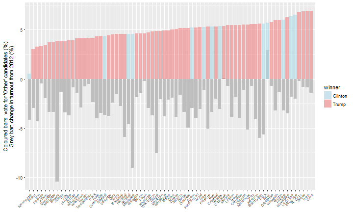
It is also worth considering the change in votes for 'other' candidates between 2012 and 2016. The following figure shows that 1. there is a broad spread in voting 'other' by county, without any outlying counties that jump out (apart from Menominee, which is the county with the smallest population), and 2. votes for 'other' did not seem to be correlated with the change in voter turnout from 2012.
There was a large swing from Democrat to Republican in many counties
The following figure shows that in many counties, the vote swung significantly from Democrat to Republican compared to the 2012 election (often a 20 - 30% swing). However, there is no single county that stands out as an outlier in terms of an unusual switch from Democrat to Republican between 2012 and 2016.
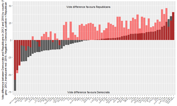 Although there was a significant swing from Democrat to Republican in many counties, in such a close election race, only small amounts of manipulation would be necessary to swing a few thousand votes here and there to change the result. Ideally, to investigate this further, I would go down to the next voting level to check for outliers or other unusual trends (the level of ward/municipality). However, this information being lacking, I can instead stay at the county level, and look at whether the presence of electronic optical scanner presence was at all linked to the voting outcome.
Optical/digital scan machine presence is correlated with turnout (among other things)
One interesting dataset provided by the Wisconsin Election Commission is the presence of Optical/Digital Scan Tabulator (from now on called optical scanner presence) on a ward-by-ward basis. I made the assumption that any manipulation of the election results would be more likely to occur in wards / counties that have a higher proportion of Optical/Digital Scan Tabulators. I have incorporated this information into the data.
In order to determine the influence optical scanner presence in a county alongside the many other potentially interacting factors that can affect the vote in each county, it is important to consider them side by side. One of the ways to quickly determine which factors are linked is by using a correlation matrix.
The factors that I assumed were potentially linked for the 2016 county vote were: 1. the change in Republican, Democrat, or 'Other' candidate vote since the last election (%), 2. the change in voter turnout (%), 3. the overall turnout, which also serves as a proxy for population (no. of people), 4. the proportion of municipalities / wards in the county that use optical scanner presence, and 5. the historical voter loyalty of the county, which I input as the number of times Democrats have won the Presidential election vote in that county from 2000-2016.
I have summarised the analysis of these interactions in a correlation matrix below. Numbers closer to 1 or -1 indicate a stronger positive or negative correlation respectively.
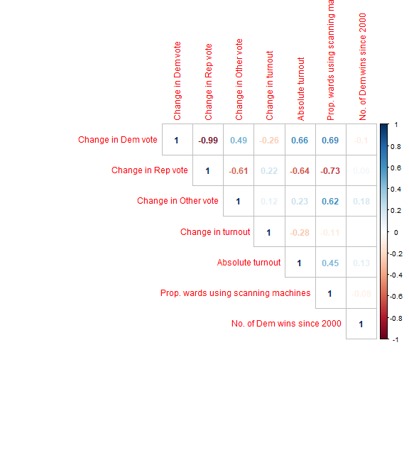 In this figure we can see that the vote change for Democrat or Republican is highly correlated with the voter turnout in the county. This factor is a proxy for county population, and suggests that the 2016 election was linked to the 'rural/urban' divide in Wisconsin; i.e. rural areas more often voted Republican, and urban areas more often voted Democrat.
We can see that the presence of optical scanner presence in the counties is somewhat correlated with the overall turnout in the county. This indicates that the counties with the largest counties are more likely to have optical scanner presence installed. When considering the change in Democrat or Republican votes between 2012 and 2016, they are highly correlated with both overall turnout AND the presence of optical scanner presence.
What this means is that the counties with the largest population, that also have the most optical scanner presence installed, are more likely to vote Democrat. It is very difficult to untangle the relative effects of county population size and the presence of optical scanner presence from this data. So, it is not worth looking further in this direction.
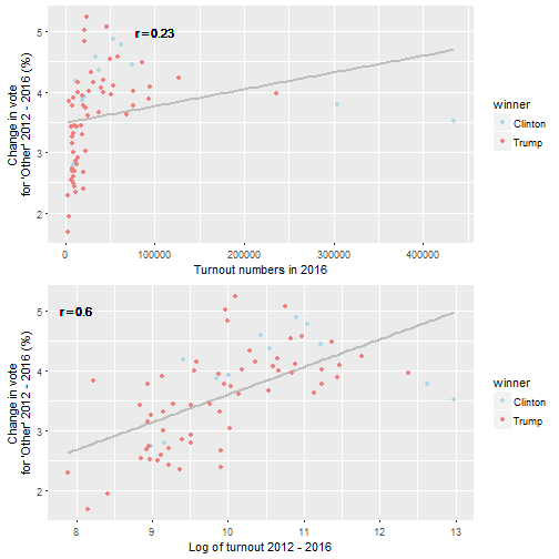
If we look at the change in vote for 'Other' candidates, we can see that it is quite highly correlated with the increase in optical scanner presence (0.62), but is not correlated with the change in turnout (0.23). Also, counties that voted more Democrat (correlated 0.49) were much more likely to have a higher 'Other' vote percentage than counties that voted more Republican (correlated -0.61).
What does this mean in reality? This would suggest that counties that voted more for 'Other' candidates were 1. more likely to be 'Democrat' voting counties, and 2. more likely to have optical scanner presence installed. Just think - if you wanted to switch an election in a swing state, one way to do this would be to switch several thousand Democrat votes to 'Other' in a few Democrat-voting counties. As long as the Republican candidate has just slightly more than the Democrat, you get the full set of Electoral College votes. That is my hypothesis from this result, BUT! Don't get excited yet...
The voter turnout variable contains a couple of large outliers (Milwaukee and Dane counties have very big turnouts compared to the rest) which seemed to be skewing the results So I decided it was worth transforming the 'turnout' variable (natual log) to try to account for this. The resulting correlation matrix I produced is below.
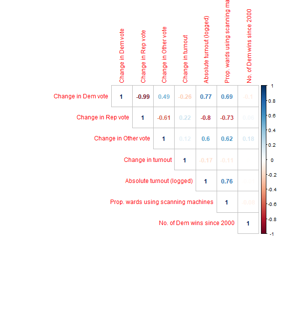
Now we can see that the change in vote for other between 2012 and 2016 is highly correlated with the log of the turnout (0.61). So, indeed, the largest counties in Wisconsin are skewing the correlation outputs. This is because Wisconsin has many small population counties (e.g. Milwaukee and Dane). So again, it is difficult to untangle the relationship between voter population per county and the presence of optical scanner presence.
Update 24-11-16: model of 'Other' candidate vote shows influence of optical/digital scanner presence
Since I wrote my original post I have been able to get hold of a bunch of demographic data from David Greenwald (@davidegreenwald) and colleagues, who have also been looking into the 2016 Wisconsin presidential election. I now have data for income, ethnicity, paper / mixed paper and machine voting, population density, and college education. If I put all of these factors into a linear model, I can compare their effects on the change in vote in 2016, and maybe untangle some of the related factors.
I roughly followed Nate Cohn's model design, which accounts for the varying effect of turnout by weighting the linear model by the turnout in each county, and applied it to the change (%) in Democrat, Republican, turnout, and Other vote. The most interesting output for the other vote is below.
##
## Call:
## lm(formula = oth.change ~ papernopaper + scan.machines.prop +
##     ratio_white_nonwhite + ratio_nocollege_college + pop_sq_mile_2010 +
##     medianhouseholdincome_2009.2013, data = model.df, weights = turnout)
##
## Weighted Residuals:
##     Min      1Q  Median      3Q     Max
## -219.00  -52.71  -10.70   48.77  242.28
##
## Coefficients:
##                                     Estimate   Std. Error t value
## (Intercept)                      3.930859829  0.727099348   5.406
## papernopaper                     0.160372007  0.146269625   1.096
## scan.machines.prop               1.057201497  0.262890238   4.021
## ratio_white_nonwhite             0.025717218  0.012715933   2.022
## ratio_nocollege_college         -0.172535987  0.066814470  -2.582
## pop_sq_mile_2010                -0.000163304  0.000060925  -2.680
## medianhouseholdincome_2009.2013 -0.000013353  0.000008954  -1.491
##                                    Pr(>|t|)
## (Intercept)                     0.000000985 ***
## papernopaper                       0.276943
## scan.machines.prop                 0.000153 ***
## ratio_white_nonwhite               0.047249 *
## ratio_nocollege_college            0.012075 *
## pop_sq_mile_2010                   0.009308 **
## medianhouseholdincome_2009.2013    0.140736
## ---
## Signif. codes:  0 '***' 0.001 '**' 0.01 '*' 0.05 '.' 0.1 ' ' 1
##
## Residual standard error: 91.49 on 65 degrees of freedom
## Multiple R-squared:  0.3929, Adjusted R-squared:  0.3368
## F-statistic:  7.01 on 6 and 65 DF,  p-value: 0.000008855
What we can see here is that when you account for the differing turnout in each county, as well as a number of demgraphic factors, the proportion of optical or digital scan tabulators in the county seems to have an influence on the 'other' vote. With increasing proportion of wards using optical or digital scanning hardware in a county, the greater the change in vote for 'Other' candidates from 2012. Other demographic factors of course have a strong effect, such as ethnicity, education, and population density. But despite them all, scanning hardware has a strong effect.
Could someone could explain these results to me! Maybe I am missing something? I have checked the model diagnostics, and I think they are good... Maybe I am missing or misusing a key Demographic variable?
What is also interesting here is that the influence of the scanning machine does not seem to have an effect regardless of who won the county in 2016. Although these results are interesting, like I already mentioned what we really need is municipality or ward-level data to confirm this with confidence. Until this data is available, we cannot assume with 100% confidence that the scanning hardware and vote for 'other' is linked. While we wait, below I highlight a few interesting graphs of the 'other' vote that may be worth looking into in greater depth later, if more data becomes available.
County results 2000 - 2016: the rise of the vote for 'Other' candidates
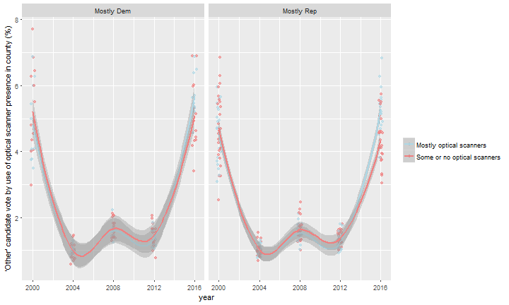
I saw a link between the presence of optical scanner presence and vote for 'Other' candidates at the county level in 2016. Can we see this trend over time? And we saw that the vote for 'Other' candidates was connected with a reducing vote for Democrats. Are the effects present in mostly Republican or Democrat voting counties? The following figures show the change in votes for 'Other' candidates with time according to the use of machines or the by the previous voting record of the county (Democrat or Repulican).
The vote percentage for 'other' candidates was generally higher in 2016 than in earlier elections, and was even higher for counties that use optical scanner presence. However, the difference was similar whether the county has mostly voted Democrat or Republican since 2000. This suggest that broadly, Democrat-leaning counties with optical scanner presence did not have a different vote for 'other' candidates compared to Republican-leaning counties. This is interesting, as it suggests that the presence of scanning hardware increased the 'other' vote in counties regardless of political leanings.
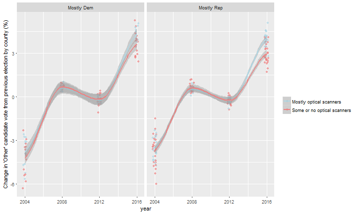
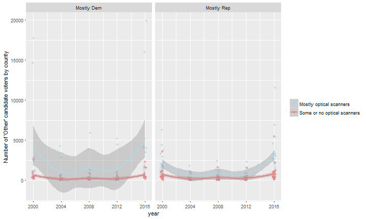
In the other voter graph below, note how the high-population counties skew the results (particularly Milwaukee and Dane counties). This again highlights the need for ward-level voting data in order to conduct a full analysis of this voting data.
Conclusion
In general, the Wisconsin 2016 elections fell within historical ranges in terms of turnout, votes for Democrat and Republican party, and swing from Democrat to Republican. This election does stand out in terms of the increased votes for 'other' parties compared to previous contests; however this trend parties matched closely the national averages.
I checked the results of the Wisconsin election at the county level. Using a linear model, I found that the change in the vote for 'Other' candidates between 2012 and 2016 increased with the increasing presence of optical or digital scanning hardware in a county. Despite this significant finding, it is not possible to be confident of the influence optical scanner presence on county level voting in Wisconsin in 2016 with the data available. To fully investigate a potential influence of optical scanner presence further, we need the voting data at the level of voting ward / municipality. This is especially important in counties with high populations, e.g. Milwaukee, where small changes in turnout and vote preference in 2016 could have significantly affected the result.
Click here to go back to the blog home page.
Update 23-11-16: Influence of optical scanner presence on turnout
Following this article, suggesting that 2016 voter turnout was affected by the presence of optical scanner presence, I have updated by analysis.
The article states "The academics presented findings showing that in Wisconsin, Clinton received 7 percent fewer votes in counties that relied on electronic-optical scanner presence compared with counties that used optical scanners and paper ballots. Based on this statistical analysis, Clinton may have been denied as many as 30,000 votes; she lost Wisconsin by 27,000."
Update 24-11-16: note that this quote has since been refuted
As a reminder, in the following analysis, I class a county with 'mostly optical scanner presence' as one where 75% or more of the voting districts in the county use at least one type of 'Optical/Digital Scan Tabulator'. I have taken the data on scanning machine presence from this file - all types of voting equipment under the heading 'Optical/Digital Scan Tabulator' are counted in this calculation, and are henceforth called 'optical scanner presence'. The definition of 'scanning machine' in the article I linked above may explain the discrepancy between my findings and theirs.
Let's first look at the average 2016 county turnout by optical scanner presence and by counties that were won mostly by Democrats or Republicans since the 2000 presidential election. We can see that there is a 4% higher turnout in mostly Republican-voting counties with optical scanner presence compared to mostly Democrat-voting counties with optical scanner presence. The same difference is not visible in counties without optical scanner presence.
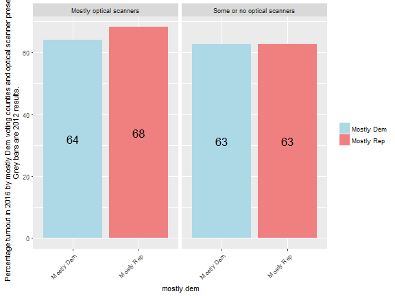
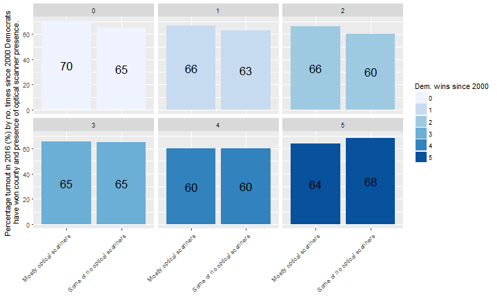
Looking at this at a more granular level, let's divide counties according to how many times that democrats have won the county since 2000. Again, we can see that in counties with a lower number of Democrat wins since 2000, there is a higher turnout in 'scanning machine' counties; 5% for counties with no Democrat wins.
So we can see from the publicly-available data that in the 2016 election, mostly Republican voting counties with optical scanner presence seemed to have a higher turnout than mostly Democrat voting counties with optical scanner presence, which confirms what the article is suggesting.
This data seems interesting, but is it significant? Using the same modelling method as previously I used for the 'Other' vote, I analysed the change in turnout.
##
## Call:
## lm(formula = turnout.change ~ papernopaper + scan.machines.prop +
##     ratio_white_nonwhite + ratio_nocollege_college + pop_sq_mile_2010 +
##     medianhouseholdincome_2009.2013 + dem.change, data = model.df,
##     weights = turnout)
##
## Weighted Residuals:
##     Min      1Q  Median      3Q     Max
## -982.83 -188.56   19.01  142.90  920.75
##
## Coefficients:
##                                    Estimate  Std. Error t value Pr(>|t|)
## (Intercept)                     -1.34141022  3.13785462  -0.427 0.670455
## papernopaper                    -0.37700804  0.53561713  -0.704 0.484063
## scan.machines.prop              -0.89406472  0.96377939  -0.928 0.357067
## ratio_white_nonwhite             0.04715464  0.04736744   0.996 0.323239
## ratio_nocollege_college         -1.11242685  0.32893072  -3.382 0.001232
## pop_sq_mile_2010                -0.00126693  0.00031913  -3.970 0.000185
## medianhouseholdincome_2009.2013  0.00002382  0.00004248   0.561 0.576919
## dem.change                      -0.27469001  0.13230424  -2.076 0.041897
##
## (Intercept)
## papernopaper
## scan.machines.prop
## ratio_white_nonwhite
## ratio_nocollege_college         **
## pop_sq_mile_2010                ***
## medianhouseholdincome_2009.2013
## dem.change                      *
## ---
## Signif. codes:  0 '***' 0.001 '**' 0.01 '*' 0.05 '.' 0.1 ' ' 1
##
## Residual standard error: 333.8 on 64 degrees of freedom
## Multiple R-squared:  0.6984, Adjusted R-squared:  0.6654
## F-statistic: 21.17 on 7 and 64 DF,  p-value: 0.00000000000001848
It is quite clear from the model that the use of 'paper or no paper' voting and the presence of scanner machines does not have an effect on turnout. However, a reduced vote for Democrat seems to be linked to the turnout - indicating that those people who didn't turn up were more likely to have voted Democrat.
In the time since I wrote this update, the computer scientist (J. Alex Halderman) who was quoted in the NYmag article has himself written an article on Medium to say that in fact, the quote was not correct. So perhaps, this 'finding' was in fact not a finding at all.
Comments !